What We Can Learn from Trees

Design Sector
Print / Infographic / Motion Graphics
Deliverables
  • A multi-page magazine spread + infographics
  • 30 second video accessed through a QR code
Project Goals
  • To create a story that people who do not have a scientific background will understand
  • Use innovative methods (QR) to enhance the project

About the Project

This project was drawn from my undergraduate thesis (Comparison of white and black spruce growth within the Boreal Forest-Tundra ecotone in the Northwest Territories), which examines the potential climate influences and trends in these two tree species through the study of dendrochronology. The goal is to take this academic paper and turn it into a visualized magazine story and infographic, digestible by a wider audience.

Process: Magazine

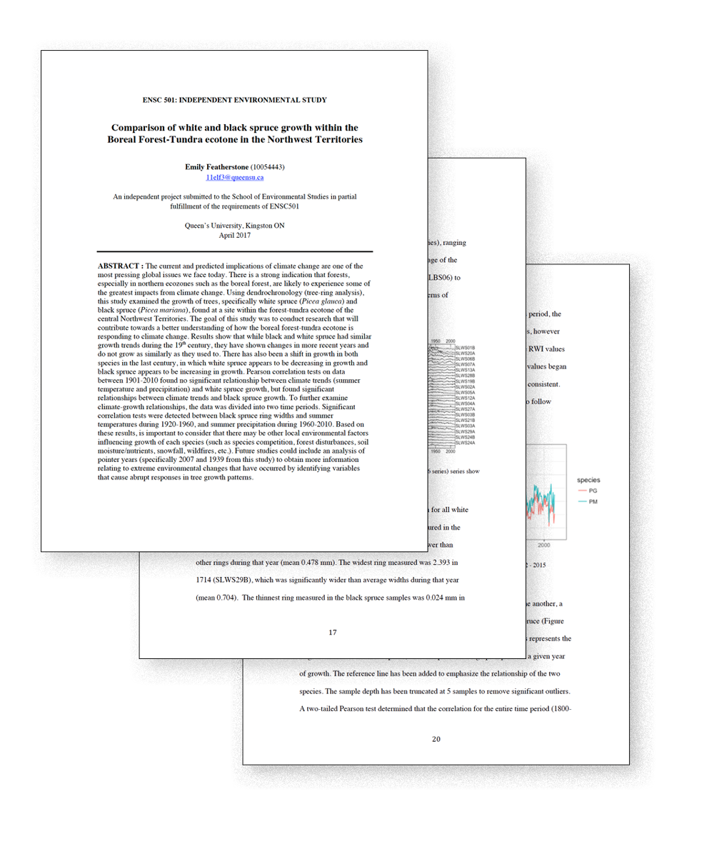
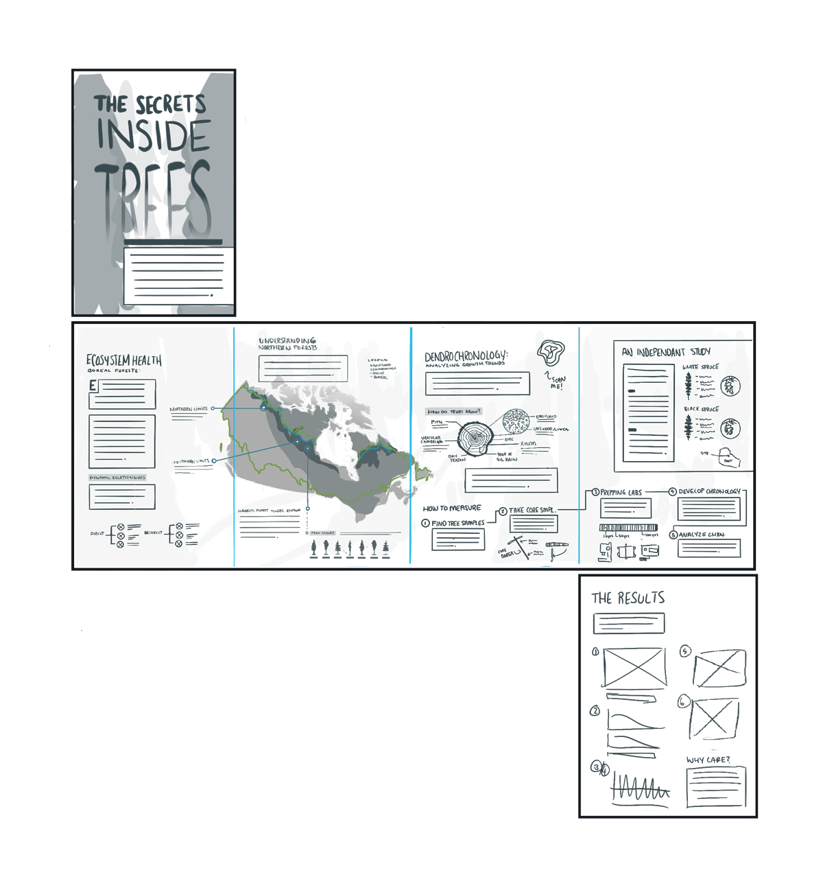
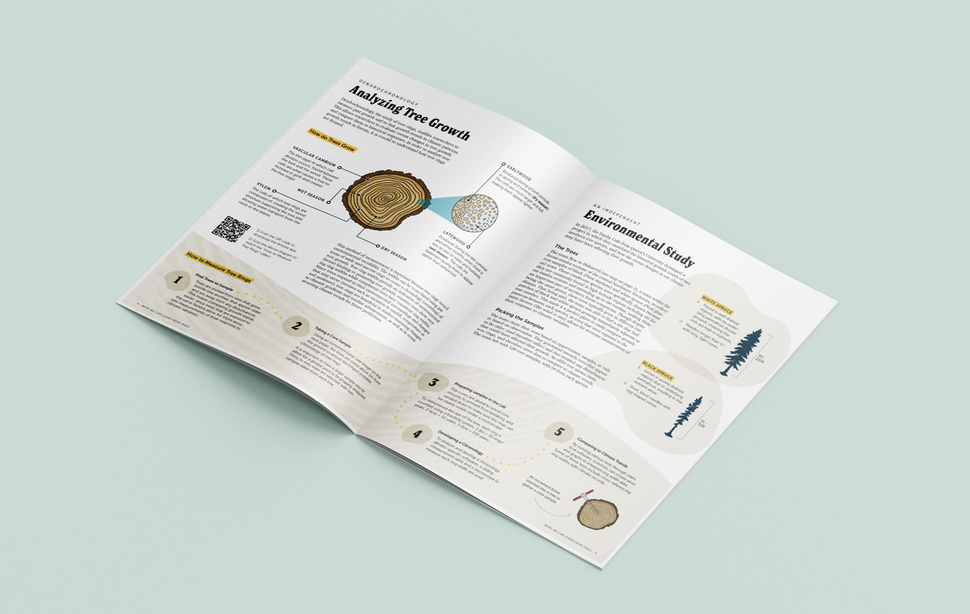
Research and Writing

The original research for the content of this spread was created in 2017 by me at Queen’s University for an undergraduate thesis. This paper was 44 pages long, including statistical outputs and graphs. Given the length of this paper, it was important to not only narrow down the information, but also make it understandable to people with minimal knowledge on the topic or sciences in general.

Layout Sketches

Once I decided on the sections from the thesis I wanted to include, I began to create rough layout sketches and diagrams. I then took my original sketch and flushed them out. This gave me a more realistic and accurate outline as to where exactly my content would go and brainstorm what kinds of graphic elements I wanted to include. I then created my document  and determined the amount of text that flowed through. I then determined my fonts and put together my paragraph styles before continuing on to creating graphic assets.

Process: Animated Short

Audio Script and Animatic

To give more depth to this project, I decided to create an animated short describing one of the magazine's sections on "How to Measure Tree Rings". I took the steps from this section, re-wrote it to suit an audio format, and then recorded it myself. To help figure out the flow of the animation, I created sketches to go along with the audio, in which I used to create an animatic. This helped me with timing and to smooth out any wrinkles before going to create the final assets.

Storyboard Sketches & Styleframes

After I had finalized the animatic, I created some basic style frames to determine the look and feel of the animated short. I wanted the animation to have the same feel as the magazine (since they are paired together), so used similar illustration styles, fonts and colours.

Process: Creating Augmented reality

Adding a Layer of Innovation

To yet again further the user experience and add an element not commonly seen in magazine spreads, I have added an AR element to this article. Through the use of Artivive, I was able to pair one of the diagrams to the app, which when scanned, will allow to use to view the animated video mentioned above. All the use needs to do is scan the QR code to download the app, put the diagram into view and enjoy!

Final Results

The final results of this magazine successfully addressed the two main problems with the original thesis – it was too long and not digestible for a broad audience. By highlighting the key points, simplifying the language and adding graphical elements, this paper is now a much more engaging article. Including motion elements further enhances the readers experiences and adds a unique perspective to reading magazines.

Mockup of magazine, front cover and first two pages
Mockup of magazine, pages three and four
Mockup of magazine, back and front covers